| « Loading Thumbnails | Index | Background Image » |
Text Formatting
Text formatting consists of text alignment, trimming, font and color. It can be adjusted on column headers, groups, items and sub-items.
Formatting File Names
In case the Better Thumbnail Browser is populated automatically by files from a folder (specified by setting the Path property), the file name format can be specified by setting the FilenameFormatOptions property. It is an enumeration with following flags:
-
None
-
No extra formatting applied.
-
-
LowerCase
-
Convert label to lower case.
-
-
UpperCase
-
Convert label to upper case.
-
-
ShowExtension
-
Include file extension.
-
Multi-line Text
Item labels can have multiple lines and custom line breaks can be used. The maximum allowed number of text lines is specified by ThumbnailTextLines property.
For more information about formatting text, see Text Layout.
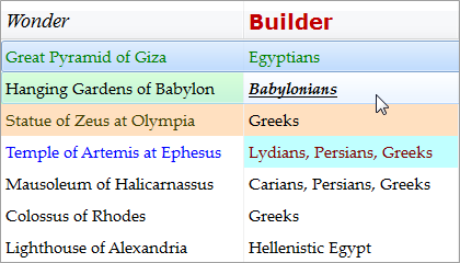
Customized Item/Sub-tem Text
Items and sub-items display the same string as specified in their Text property. You can format this text for display without changing the source string in the Text property.
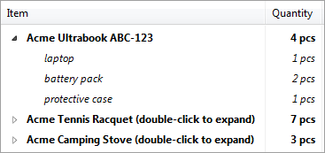
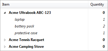
For example, one may have data bound items with numbers. The item Text property contains value "35", but he wants to display "35 pcs" without altering the Text property, which would cause modifying the data source.
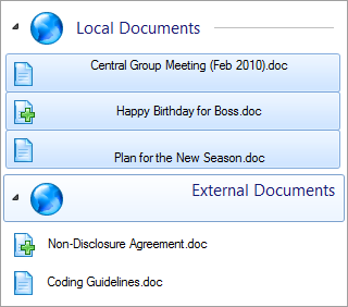
The following screenshots show list with and without custom text formatting:
To enable formatting, set the BetterListViewItem.FormatText (BetterListViewItem.FormatText) property on the respective item or sub-item. Then add handler for FormatText event and use the properties of BetterListViewFormatItemEventArgs:
-
Item
-
Item which is being formatted.
-
-
SubItemIndex
-
Index of sub-item which is being formatted. If you have multiple sub-items in your list, the FormatText event will be raised several times for each sub-item.
-
-
CurrentText
-
Original text to be formatted.
-
-
NewText
-
Formatted text. The property initially contains same value as CurrentText and can be changed in the FormatText event handler.
-
The formatted text can be retrieved in run-item using the BetterListViewItem.DisplayText (BetterListViewSubItem.DisplayText). This property has no setter because the display text can only be changed via the formatting event (FormatText).
If you want to re-format the text, call BetterListViewItem.RefreshDisplayText method. Of course, if you want to refresh multiple items, it is more convenient to wrap BetterListViewItem.RefreshDisplayText() calls between BeginUpdate() and EndUpdate()calls (see Performance - Using BeginUpdate and EndUpdate).
Text Alignment
Text in column header, item, sub-item and group elements can be aligned horizontally and vertically. The following images shows different horizontal alignment of sub-items...
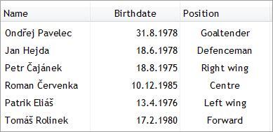
...and groups:
Following properties govern horizontal text alignment on different element types:
-
BetterListViewColumnHeader.AlignHorizontal
-
BetterListViewGroup.HeaderAlignmentHorizontal
-
BetterListViewItem.AlignHorizontal
-
BetterListViewSubItem.AlignHorizontal
All of these are of type TextAlignment with values Left, Center, Right and Default.
Following properties govern vertical text alignment on different element types:
-
BetterListViewColumnHeader.AlignVertical
-
BetterListViewGroup.HeaderAlignmentVertical
-
BetterListViewItem.AlignVertical
-
BetterListViewSubItem.AlignVertical
All of these are of type TextAlignmentVertical with values Top, Middle, Bottom and Default.
The Default value means that the alignment is determined from the current view default (this default alignment can also be modified, see Default Text Alignment and Trimming).
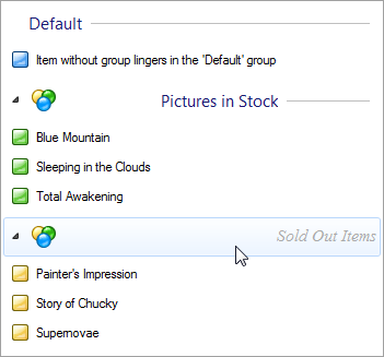
Following image shows different text alignments in the selected items and group:
Text Trimming
Text trimming is a method of shortening text when it is otherwise too long to be displayed in text area. There are several trimming options:
-
None
-
No triming is applied and the text is just clipped,
-
-
Character
-
Text is trimmed to the last visible character.
-
-
Word
-
Text is trimmed to the last visible word.
-
-
EllipsisCharacter
-
Same as Character, but ellipsis (…) is added at the end of the text.
-
-
EllipsisWord
-
Same as Word, but ellipsis (…) is added at the end of the text.
-
-
EllipsisPath
-
Trimming for paths, the beginning and end of the path is retained and the ellipsis (…) is added in the middle of the text.
-
Here is an example of different trimming methods in action:
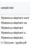
Text trimming works also with multi-line text (see Text Layout), here is an example of breaking text into a maximum of four lines and then trimming with ellipsis:


Following properties on different elements govern text trimming:
-
BetterListViewColumnHeader.TextTrimming
-
BetterListViewGroup.TextTrimming
-
BetterListViewItem.TextTrimming
-
BetterListViewSubItem.TextTrimming
Text Wrapping
Text wrapping defines how item (sub-item) text is broken in several lines with respect to other sub-items. This property can be set only on items (BetterListViewItem.TextTrimming) and sub-items (BetterListViewSubitem.TextTrimming) and the property has one of three values:
- Layout
-
Default value. Item (sub-item) text can be split to number of lines defined by MaximumTextLines property of the corresponding layout (see Text Layout).
-
- Space
-
Item (sub-item) text can be split to several lines, but only up to available space.
-
- None
-
Item (sub-item) text cannot be split (single line only).
-
The effect of different text wrapping modes can be seen on the following screenshot:
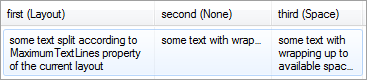
The sub-item in the first column has TextWrapping set to Layout, hence the text is split in up to four lines (MaximumTextLines is 4 in the sample).
The sub-item in the second column has TextWrapping set to None, hence the text not wrapped.
The sub-item in the third column has TextWrapping set to Space, so even though the text can be split to four lines, it can be split to only available space, which allows for only three lines. The available space here is governed by the first sub-item.
Hotkey Prefix
The hotkey prefix is an underlined character in item/sub-item label. It is indicated by ampersand (&) character before the character to be displayed with underline. The following picture show item with hotkey prefix display turned off and on:

The hotkey prefix can be used for easier navigation in items (e.g. menu items) with just key presses. The actual implementation of such behavior is up to user, but Better ListView allows displaying hotkey prefixes on items and sub-items by setting BetterListViewItem.HotkeyPrefix (BetterListViewSubItem.HotkeyPrefix, respectively) to true.
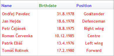
Font and Color
Column header, group, item and sub-item can have its own font and color:
Font and colors are controlled with properties Font, ForeColor and BackColor.
By default, elements does not have a specific font and foreground color set and there are fallback schemes to obtain these values. The arrows in the schemes mean if not set, use the following value.
Column headers:
-
BetterListViewColumnHeader.Font → BetterListView.FontColumns → BetterListView.Font
-
BetterListViewColumnHeader.ForeColor → BetterListView.ForeColorColumns → BetterListView.ForeColor
Groups:
-
BetterListViewGroup.Font → BetterListViewGroup.FontGroups → BetterListViewGroup.DefaultFont
-
BetterListViewGroup.ForeColor → BetterListViewGroup.ForeColorGroups → BetterListViewGroup.ForeColor
Items:
-
BetterListViewItem.Font → BetterListView.FontItems → BetterListView.Font
-
BetterListViewItem.ForeColor → BetterListView.ForeColorItems → BetterListView.ForeColor
-
BetterListViewSubItem.Font → BetterListView.FontItems → BetterListView.Font
-
BetterListViewSubItem.ForeColor → BetterListView.ForeColorItems → BetterListView.ForeColor
Sub-items take into acount BetterListViewItem.UseItemStyleForSubItems.
To better understand these schemes, look at the following sample code:
C#
// all elements will be red
listView.ForeColor = Color.Red;

// ...except for column headers which will be blue
listView.ForeColorColumns = Color.Blue;

// ...except for second column header, which will be green
listView.Columns[1].ForeColor = Color.Green;
Visual Basic
' all elements will be red
listView.ForeColor = Color.Red

' ...except for column headers which will be blue
listView.ForeColorColumns = Color.Blue

' ...except for second column header, which will be green
listView.Columns(1).ForeColor = Color.Green
The result looks like this:
Bold Items
Items and sub-items can be displayed with strong appearance using BetterListViewItem.IsBold property (BetterListViewSubItem.IsBold, respectively):
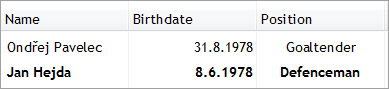
Sub-items take into acount BetterListViewItem.UseItemStyleForSubItems.
Sample Source Code
C#
//
// create item with untrimmed text
//
BetterListViewItem itemNoTrim = new BetterListViewItem();

itemNoTrim.Text = "Label of this item does not use any trimming, so it is simply clipped.";
// set no trimming for this item (text will be just clipped)
itemNoTrim.TextTrimming = TextTrimming.None;

//
// create item with word-trimmed text
//
BetterListViewItem itemTrimWord = new BetterListViewItem();

itemTrimWord.Text = "Label of this item is trimmed to the nearest word. Resize the window to see how this works.";
// set trimming to whole words in this item
itemTrimWord.TextTrimming = TextTrimming.EllipsisWord;

this.listView.BeginUpdate();

this.listView.Items.AddRange(
    new[]
    {
        itemNoTrim,
        itemTrimWord
    });

// resize items in Details view with content to show how the text gets trimmed
// other way would be to add column and see text breaking when resizing the column
this.listView.AutoSizeItemsInDetailsView = true;

this.listView.EndUpdate();
Visual Basic
'
' create item with untrimmed text
'
Dim itemNoTrim As New BetterListViewItem()

itemNoTrim.Text = "Label of this item does not use any trimming, so it is simply clipped."
' set no trimming for this item (text will be just clipped)
itemNoTrim.TextTrimming = TextTrimming.None

'
' create item with word-trimmed text
'
Dim itemTrimWord As New BetterListViewItem()

itemTrimWord.Text =
    "Label of this item is trimmed to the nearest word. Resize the window to see how this works."
' set trimming to whole words in this item
itemTrimWord.TextTrimming = TextTrimming.EllipsisWord

ListView.BeginUpdate()

ListView.Items.AddRange (New BetterListViewItem() {itemNoTrim, itemTrimWord})

' resize items in Details view with content to show how the text gets trimmed
' other way would be to add column and see text breaking when resizing the column
ListView.AutoSizeItemsInDetailsView = True

ListView.EndUpdate()| « Loading Thumbnails | Index | Background Image » |
| Better Thumbnail Browser Documentation | Copyright © 2010-2012 ComponentOwl.com |